
80s diner-inspired office decor: Design Process
- Kimya Creative Studios
- Apr 17
- 5 min read

I have a love for Cafes. Not necessarily for the coffee itself or the food, but mainly for the atmosphere. Over the years, I've enjoyed discovering new spots where I can find a nice table in a corner, take out a book or my computer and get lost in my work. People coming in and going, music playing in the background, sometimes classical and jazz instrumentals, other times the most recent songs on the pop charts. Cafes offer the type of environment that can stimulate creativity in unexpected ways. So, I got inspired to recreate that in an office space (it works both for home or commercial). Let's break down the design process for this 80s diner-inspired office.
INSPIRATION
Google images and Pinterest are great places to look for inspiration.
When pulling these images together, I try to look for the common elements within them. So what were those design choices that made 80s diner so easily recognizable? Here are my observations:

Checkerboard floors (black and white)
Colors: bright and loud within the space i.e. Reds, turquoise, teal, pink
Materials: chrome and leather
- banquettes, stools
Decor: neon lights, wall art, signage, road-related signs, clocks, posters, brand signs
Walls: colorful or neutral, often 2-3 colors
Light fixtures: often pendant light, rounded shapes
Windows: large windows letting natural light in
Atmosphere: fun, vibrant, adventurous, but still comfortable
Food!
DESIGN BRIEF
These were the main criteria for designing the space:
Fun, yet functional, professional, and modern;
Encourage collaborative work and comfort;
Create a place for snacks
Replicable within a home office or a commercial building.
No structural changes to the space
COLOR PALETTE
Based on the observations from the inspiration pictures, I decided to land on these colors.

The warm white color for the walls to create that comforting, calm atmosphere which would be grounding against the vibrancy of the red and busyness of the floor.
The black is an inevitable color due to the checkerboard floor I would incorporate. It is the trademark of the 80s diner, so I did not want to leave it out. They gray represents the chrome. The red would take center stage and the complementary teal color would be used as an accent.
Here are the color equivalence with Pantone and Sherwin Williams for selecting the paint.
Cream #fffdfa or RGB 255/253/250
- Pantone: Stalactite 11-4101
- Sherwin Williams: Arcade white SW 7100
Teal #0a7165 or RGB 10/113/101
- Pantone: Fanfare 18-4936
- Sherwin Williams: Really Teal SW 6489
Burgundy #610100 or RGB 97/1/0
- Pantone: Sun-dried tomato 19-1531
- Sherwin Williams: Show Stopper SW 7588
LAYOUT
We started with quite a standard size room. (Internal measurements: 10’11” x 12’9”).
The floors and door were a dark wood, walls painted white with a small window in the corner opposite the door.

When creating the space combining two main themes, in this case 80s diner and office, I tried to break down the most important elements. Additionally, based on the design brief, these were the things I believed should be included to make the space work:
Work area: table(s) and chair(s)
Presentation area
Storage
Snack "bar"
I try break down the needs in terms of "zones" within the space. Identify the zone and its purpose, and design according to the need of the space. Below is the final layout.
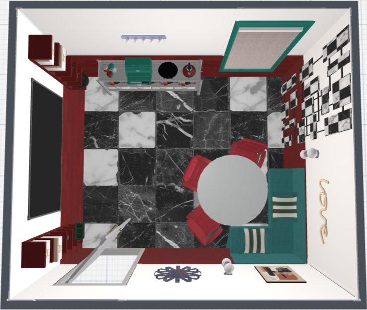
The room on its own is quite spacious and breathable. I wanted to keep that as much as possible.
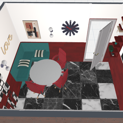
Zone 1: Collaborative work area
As soon as we open the door, we have a beautiful view of the work area, the art structure on the wall and the natural light of the window. I specifically chose that corner for the seating area to benefit as much as possible from the natural light as it is a a relatively small window for the space. Furthermore, I think that first view when entering the room sets the tone for the rest of the room: we are immediately introduced to both the office and diner aspect of the room.
Zone 2: Presentation and Storage area
On the opposite wall we have a wall for doing presentations, jotting doing ideas, planning, and storage right around it to keep markers and other important items. The selves hanging from the wal create visual interest and free up floor space.
Zone 3: Snack bar and Storage area
The metal shelf against the wall creates a nice break area where one can get a cup of coffee and some snacks before getting back to work. It also adds additional storage to keep more office items or fully make it a place dedicated for snacks.
Overall, these design choices offer a space that allows for an easy flow of movement, maximizes the use of natural light, and that is functional and professional as an office space but still with elements of fun and comfort.
DESIGN CHOICES


Floors: tricolor checkerboard with marble detail to modernize and mute the pattern.
Walls: dual color with warm white on top and burgundy rectangular tiles in wood strip pattern. Tonal variations in tiles.
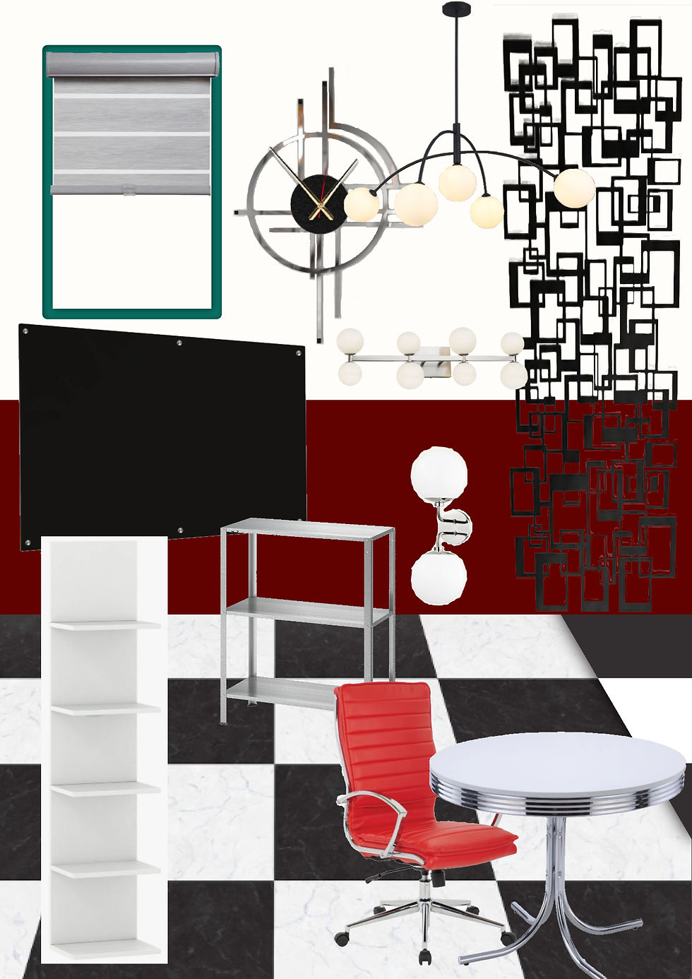
Window treatment: simple roman shade for privacy. Intended to be open most of the time.
Materials: Chrome accents in table, metal shelf storage unit, and wall sconces
Red chairs (leathers) for vibrancy and fun. Upholstered banquette in complementary teal color to add comfortable and homey element.
Lighting: Overhead lighting and wall sconces with globes to bring in some organic, rounded shapes
Decor
- Custom neon sign i.e company name
- Oversized clock,
- Custom art piece (i.e. « menu » of work rules)
- Large wall art structure helps to carry colors of the floor upward and modernize the space


SUMMARY
The design choices provide a space that is fun yet still presents as a professional, working environment.
The variety in tones creates a space that is both vibrant and calming. The darker floors and deep burgundy red keep a grounding element against the vibrancy of the red and teal chairs. The cream white color of the walls create a warm and homey feel against the chrome materials and checkerboard floors that would normally have created a space that is cold, formal, and somewhat uninviting.
Most importantly, the needs of the space have all been met. It has seating arrangements and a layout that promotes collaboration and productivity; it is functional in its storage capabilities, and provides a space for relaxation with the snack bar having its own moment against the wall.
The decor pieces allow for design choices that are personal, reminiscent of the 80s diner, yet still appropriate within the work setting.
In short, I enjoyed creating this space from scratch. If you'd like to see it come to life with actual pieces and where to find them, stay tuned for my next post. Until then, stay creative!
Comments